I'm a tech consultant with Deloitte and am currently based out of San Francisco. I graduated from Carnegie Mellon with a double-major in Information Systems and, Economics and Statistics in August 2013. I'm interested in user experience, data analysis, business analysis, food and travelling. You can check out my work, contact me at foong.inez@gmail.com or view my resume.
-

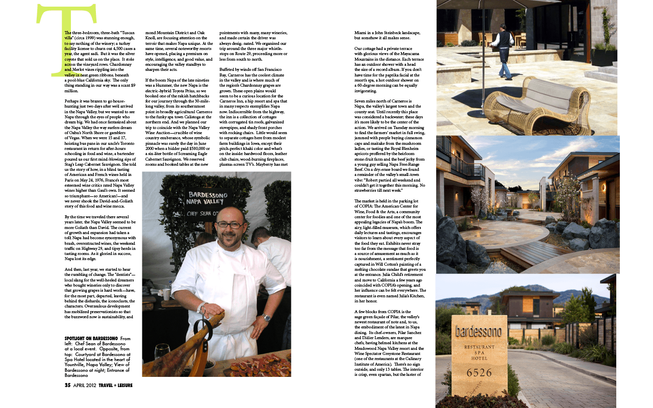
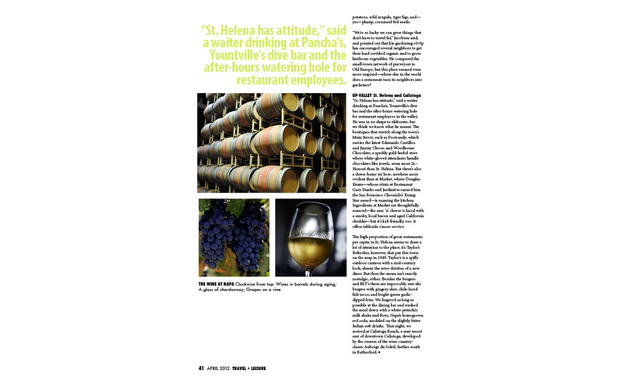
First and second pages of the magazine article
-

First and second pages of the magazine article
-

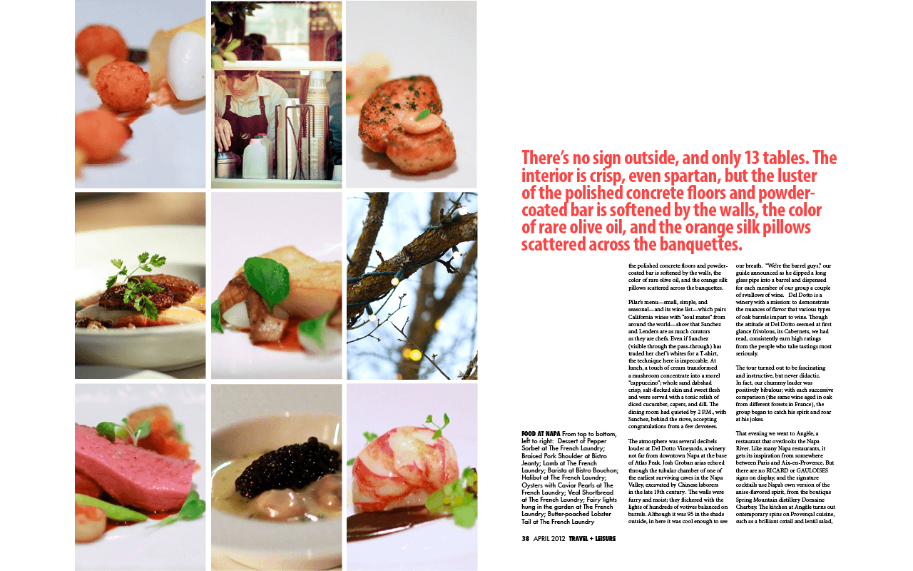
Third and fourth pages of the magazine article
-

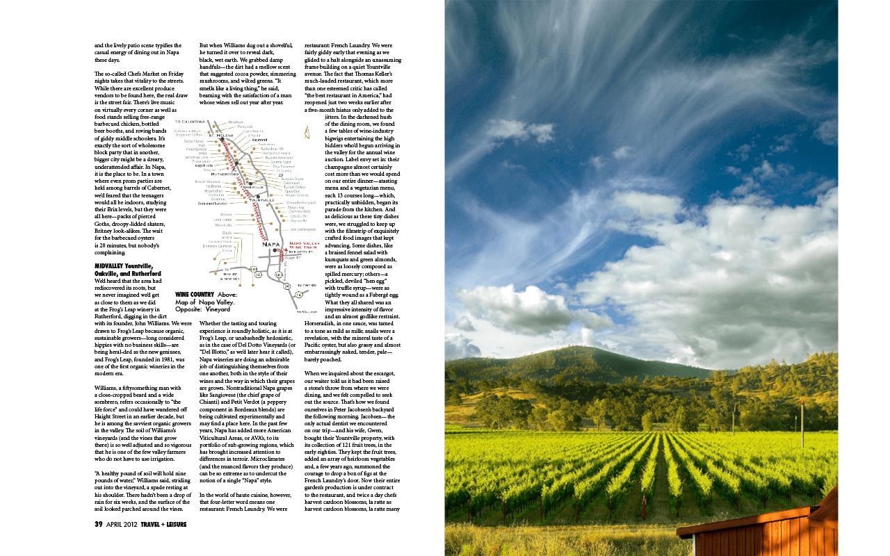
Fifth and sixth pages of the magazine article and experimenting with wrapping text around and image
-

Last page of the article
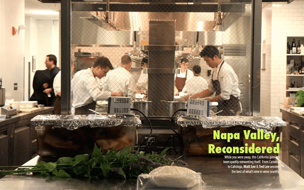
This magazine spread was an assignment for a class. I decided to create a magazine spread with Travel and Leisure in mind. I decided to utilize a 3 column grid and played around with different layouts.
×
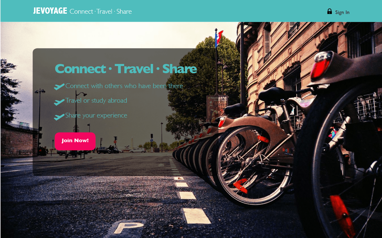
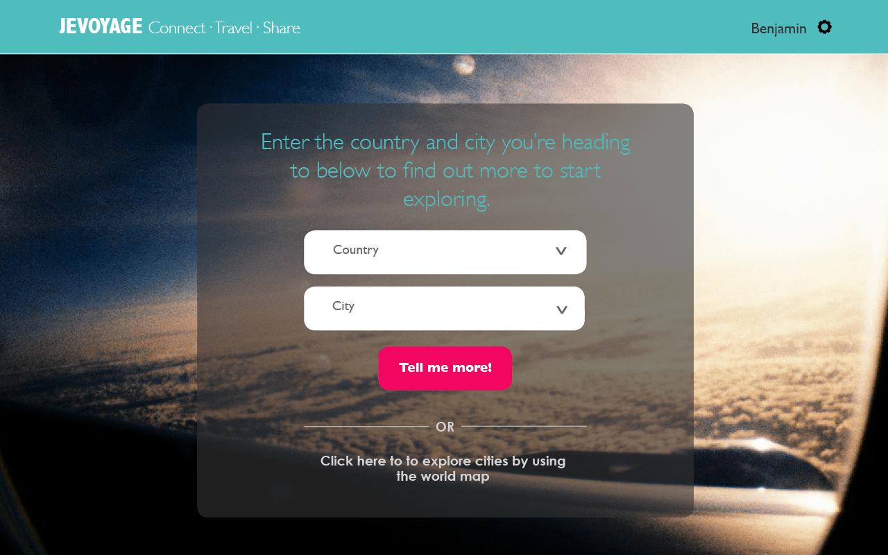
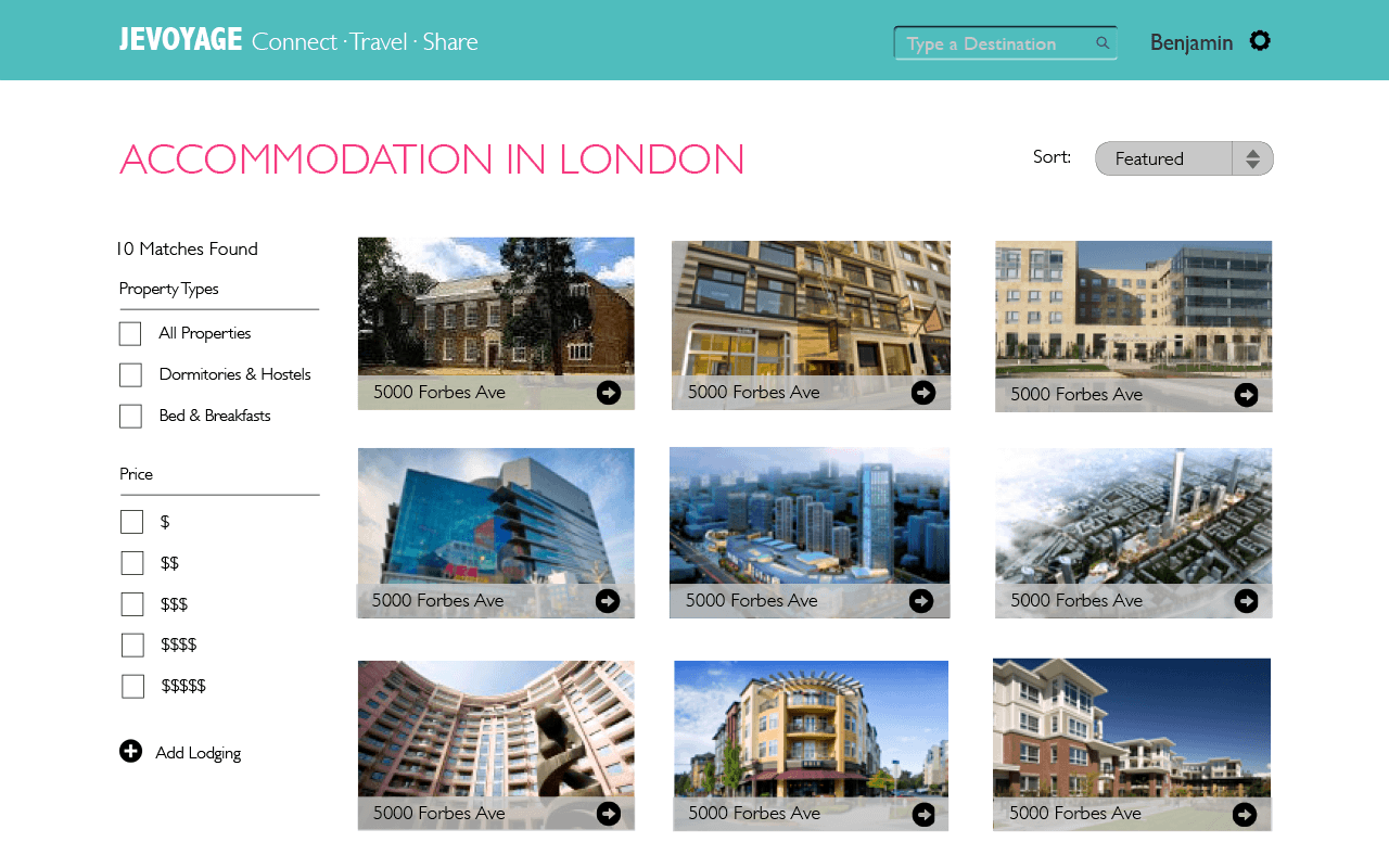
These are wireframes that I designed for a class project. The actual application is built on Ruby on Rails and Twitter Bootstrap. The application, JeVoyage, is targeted at helping college students who are travelling abroad find out more information about the city and to connect with others who have been there. With this in mind, we decided to design the application so that it would appeal to this target demographic. I also coded up these designs in HTML, CSS3 and utilizing the Twitter Bootstrap framework. Fun Fact: The greenish-blue color that we used is a slightly lighter version of this year's Pantone Color of the Year - Emerald.
×
-

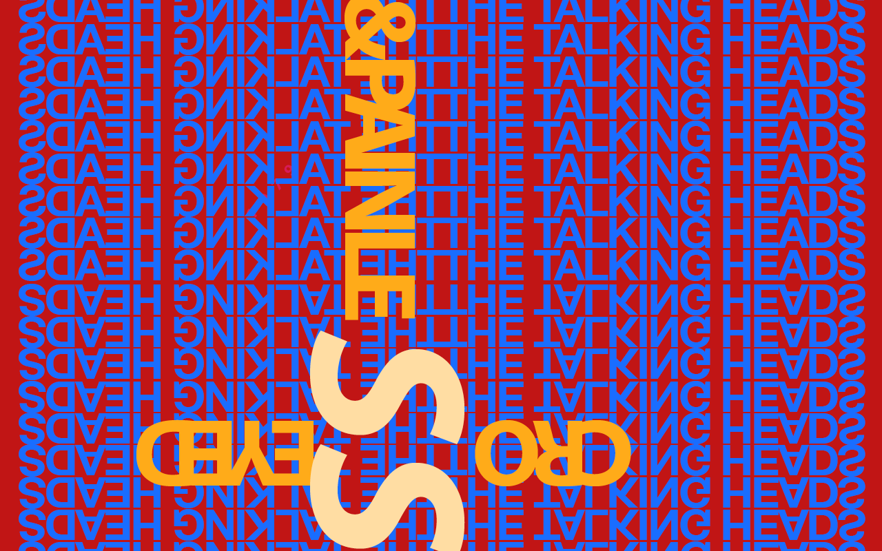
First poster
-

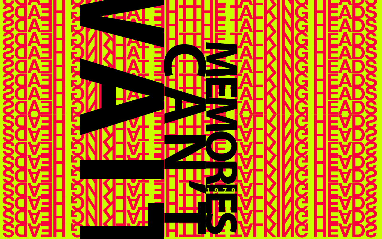
Second poster
-

Third poster
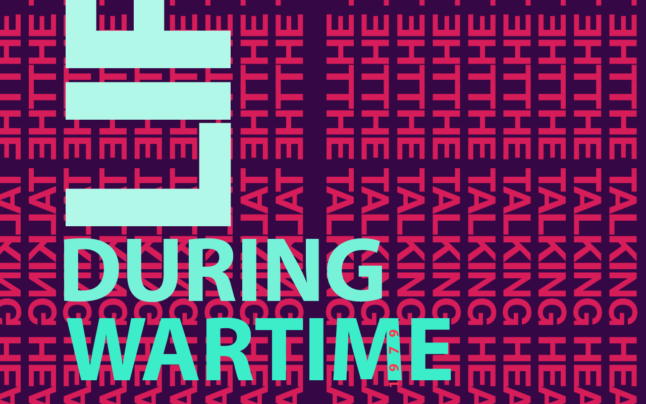
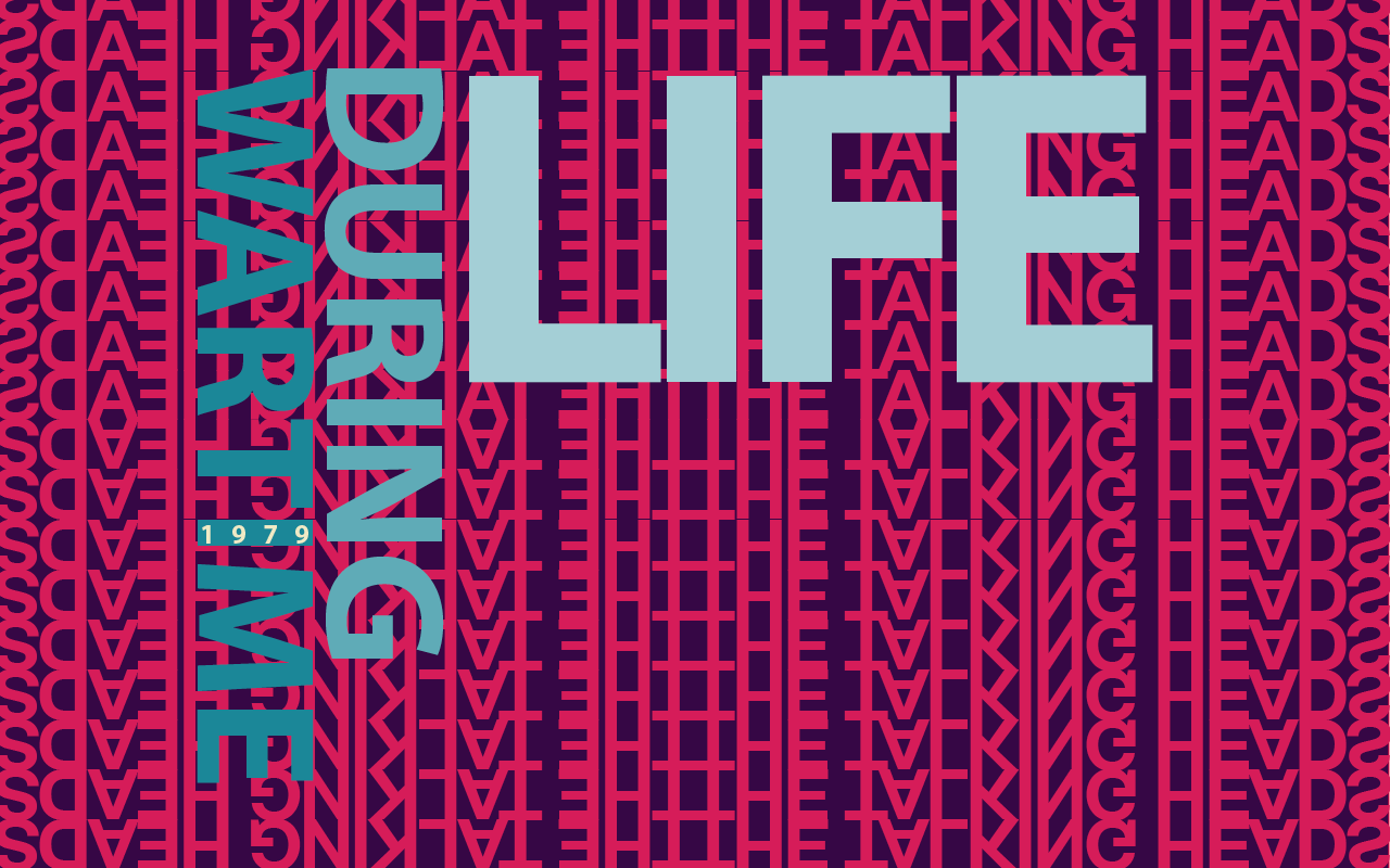
I designed a series of poster for the band, Talking Heads. This was a class assignment. In order to convey the 1980s vibe and the fast-paced nature of their music, I decided to use the band's name as the background of the posters. This also served to tie in all three posters.
×
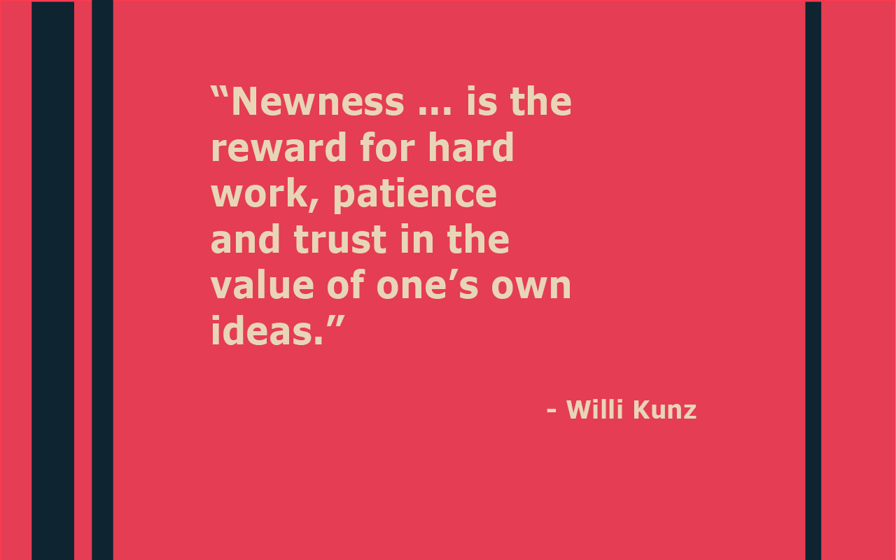
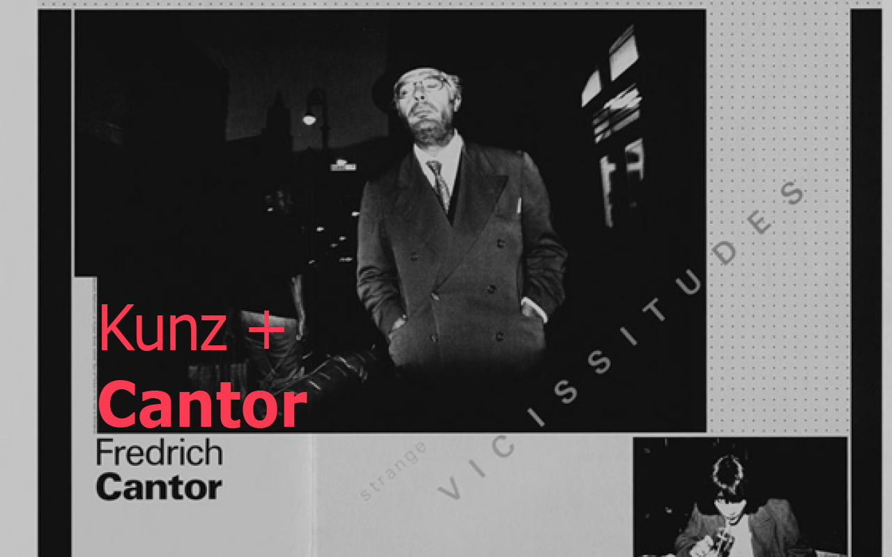
This are a selection of slides from a slide deck I made about Kuntz. There were for a class assignment. Once again, I tried to select a slightly more muted color scheme to mimic the sort of colors Kuntz used in his designs.
×
-

Poster for Meeting of the Minds
-

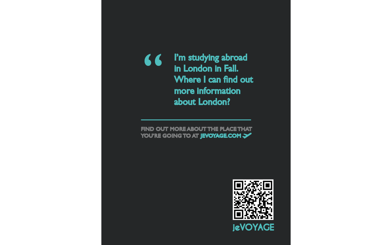
Promotional poster for Jevoyage
-

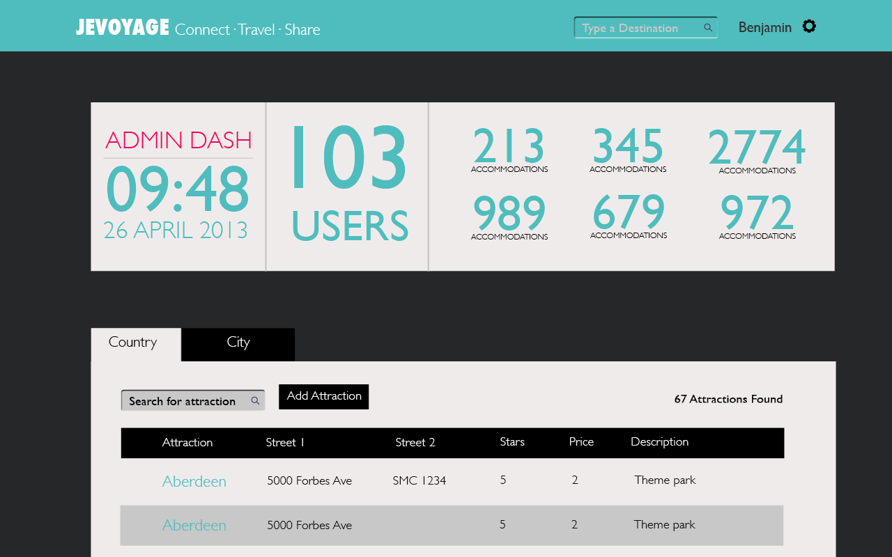
Admin Dashboard for Jevoyage site
-

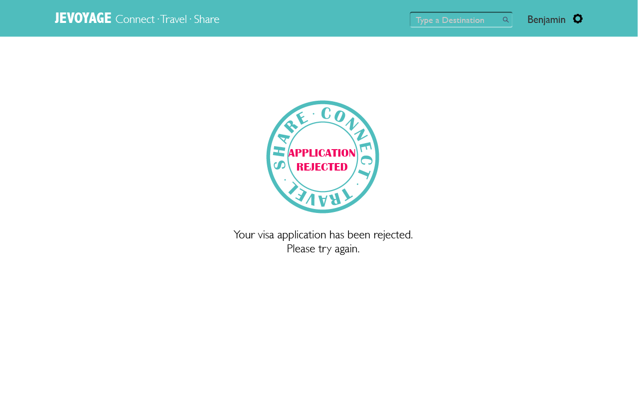
Custom error pages for Jevoyage
-

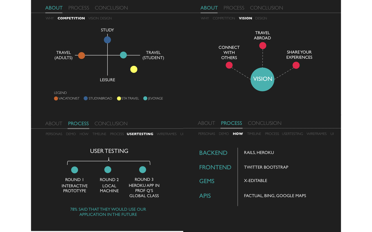
Small selection of slides made for our final faculty presentation
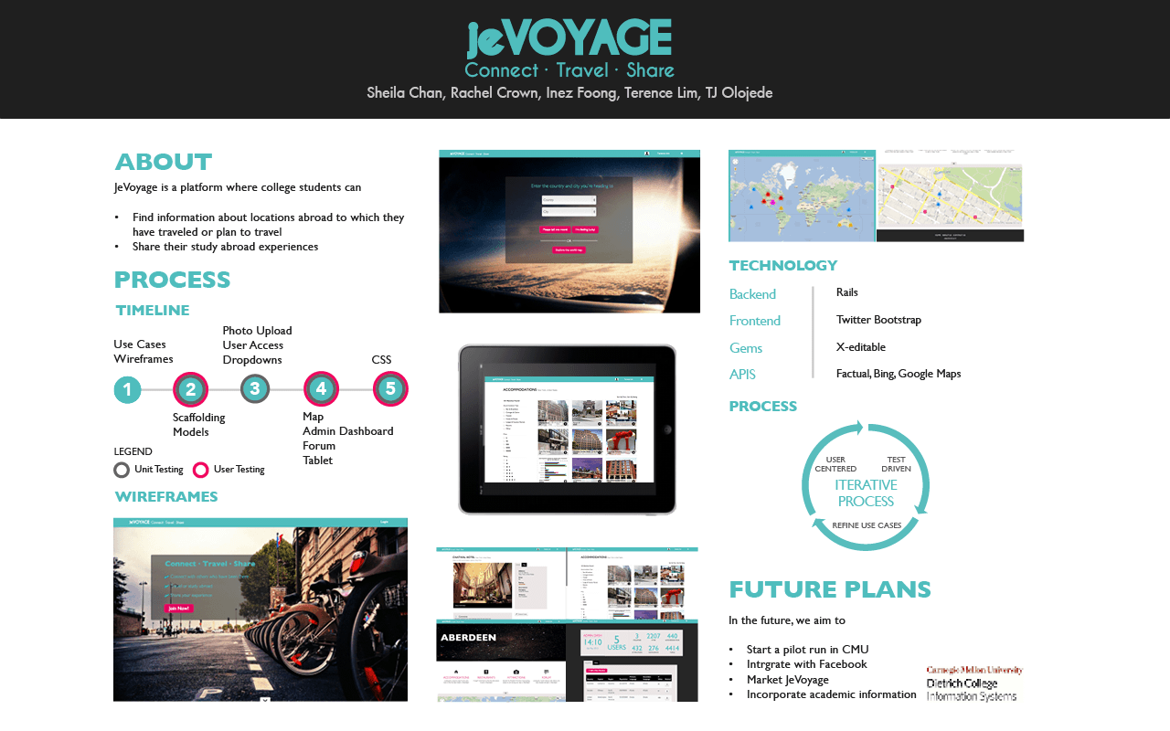
These are some of the miscellaneous design work done for Jevoyage. These include a poster for a poster presentation, a promotional poster, custom error pages and slides for our faculty presentation. When designing these, I kept in mind the design aesthetic of the Jevoyage application in terms of color and font choice. The complete set of presentations slides can be viewed here. The posters were made using InDesign. At Meeting of the Minds, our team won the second prize for the Alcoa Undergraduate Research Awards.
×
-

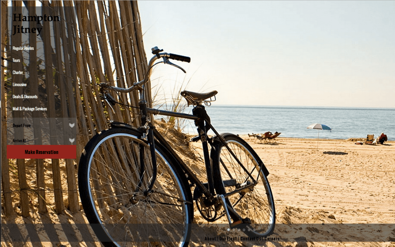
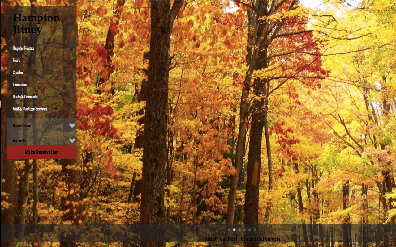
Screenshot of the landing page that I designed for the Hampton Jitney
-

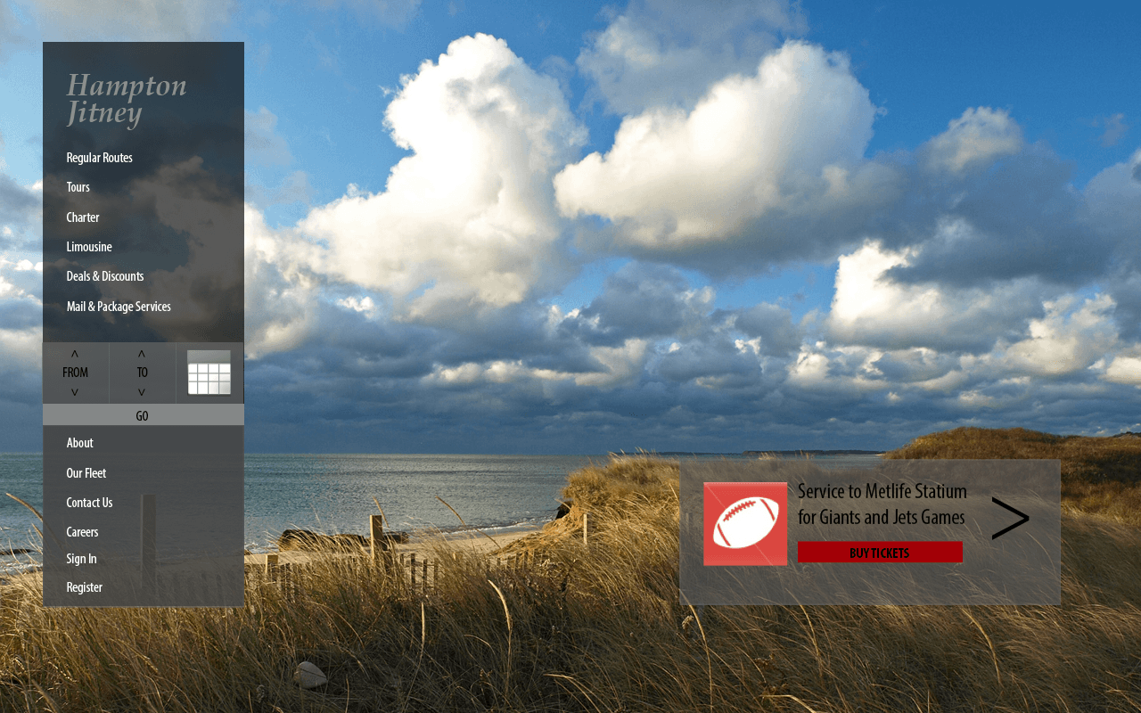
Another screenshot of the landing page that I designed for the Hampton Jitney
-

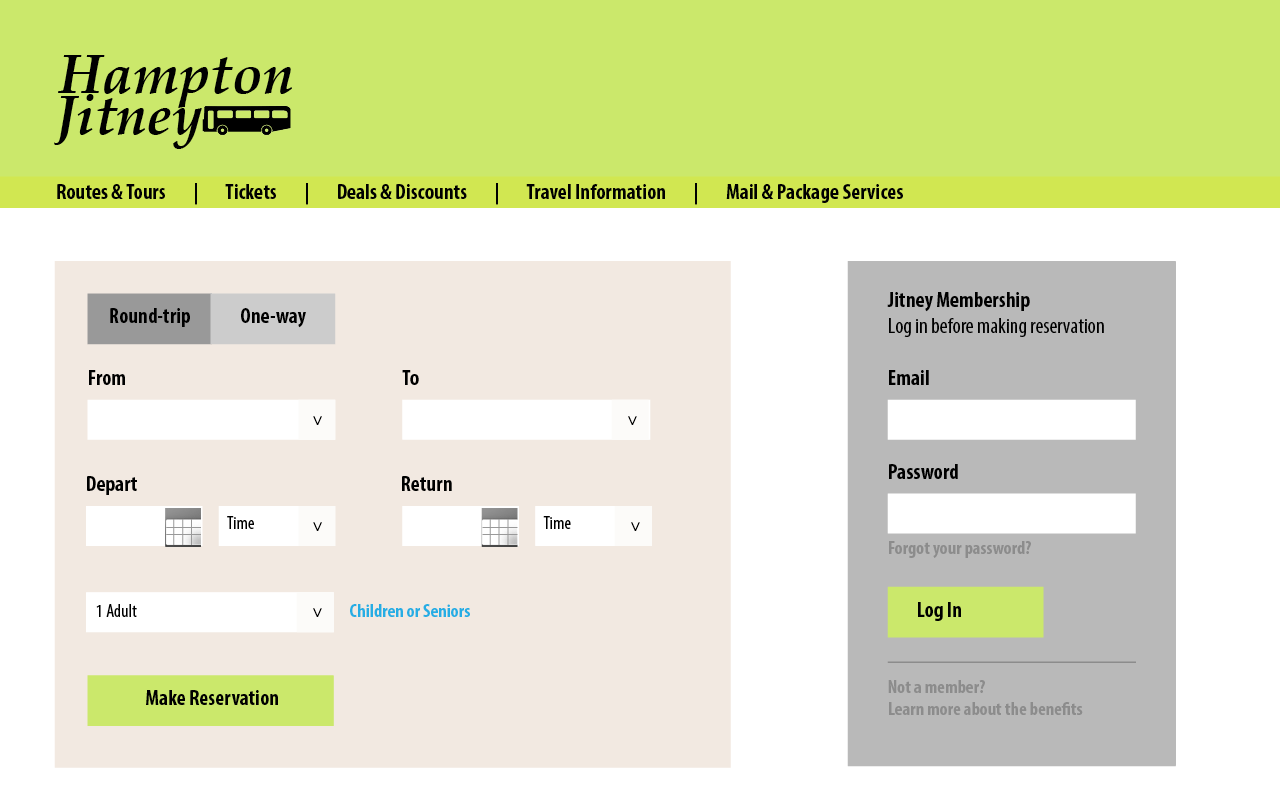
One of the wireframes made while designing the landing page
-

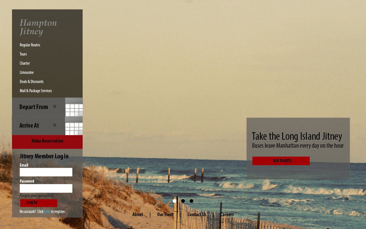
One of the initial wireframes made while designing the landing page
-

Another iteration of the wireframes made
While interning in New York in Summer 2012, I took the Hampton Jitney to Montauk. While using the website to make a reservation, I felt that the design could be further improved. As such I decided to work on redesigning their landing page. I drew inspiration from various sources including the New York City Ballet's website which inspired the use of a full screen image background with the use of a carousel. I tweaked the design to have it fit on a single page. This was primarily a chance for me to practice my front-end coding skills.
×
-

Front view of brochure
-

Back view of brochure
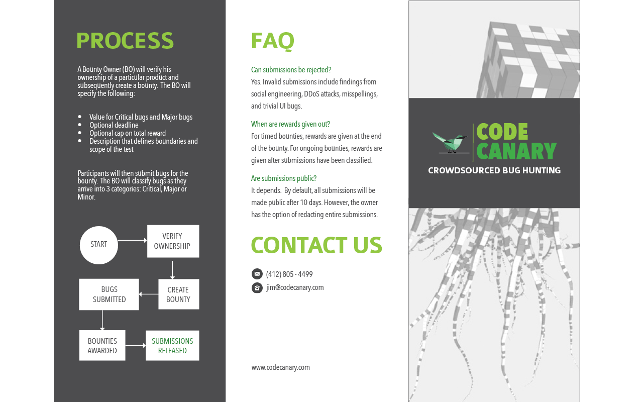
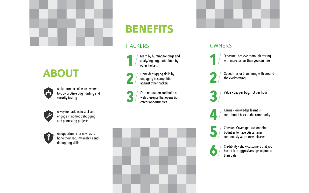
I helped a friend design a brochure for a project that he was working on. The project was about crowdsourcing bug hunting for web applications. He wanted a futuristic theme and a green-grey color scheme. I drew inspiration from the Starbucks merchandise design by Rodarte and a kite made from bytes. The images, logo and icons used are not designed by me.
×
-

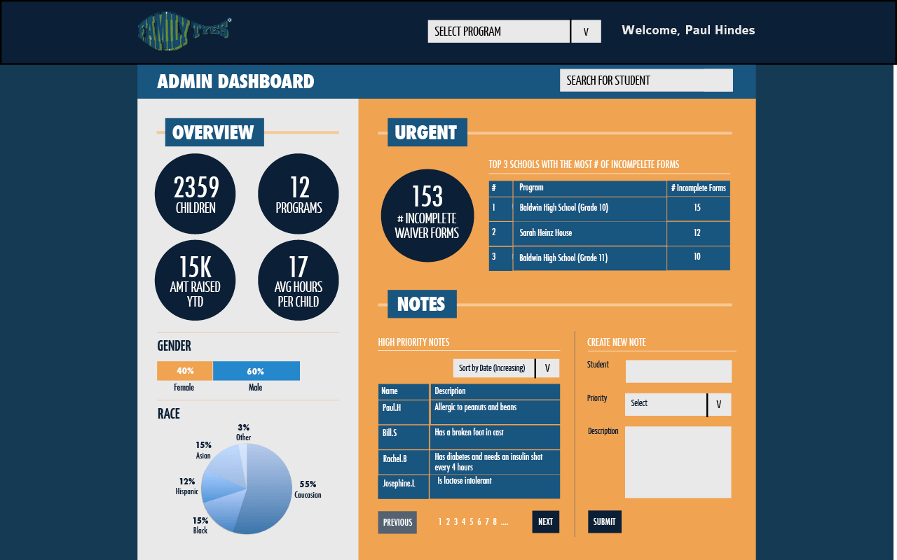
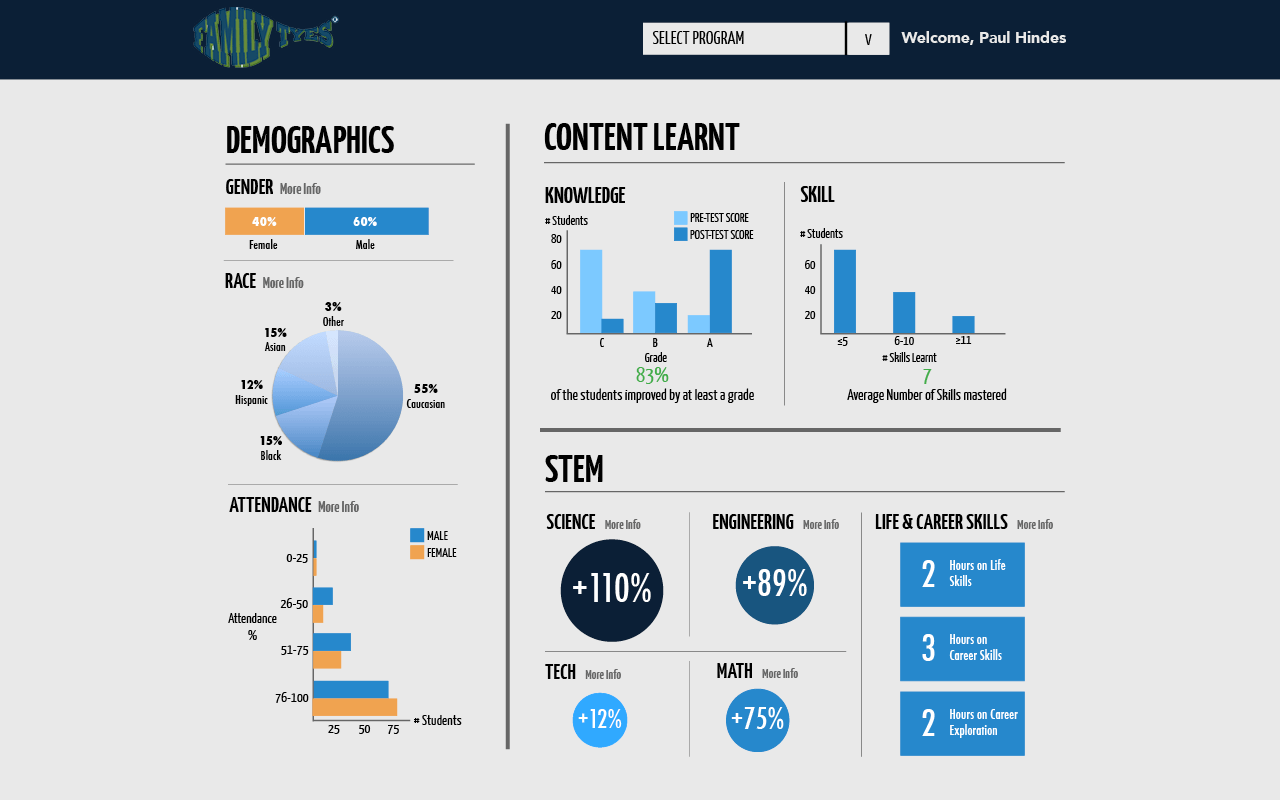
Overall Family Tyes dashboard
-

Dashboard for an individual program
-

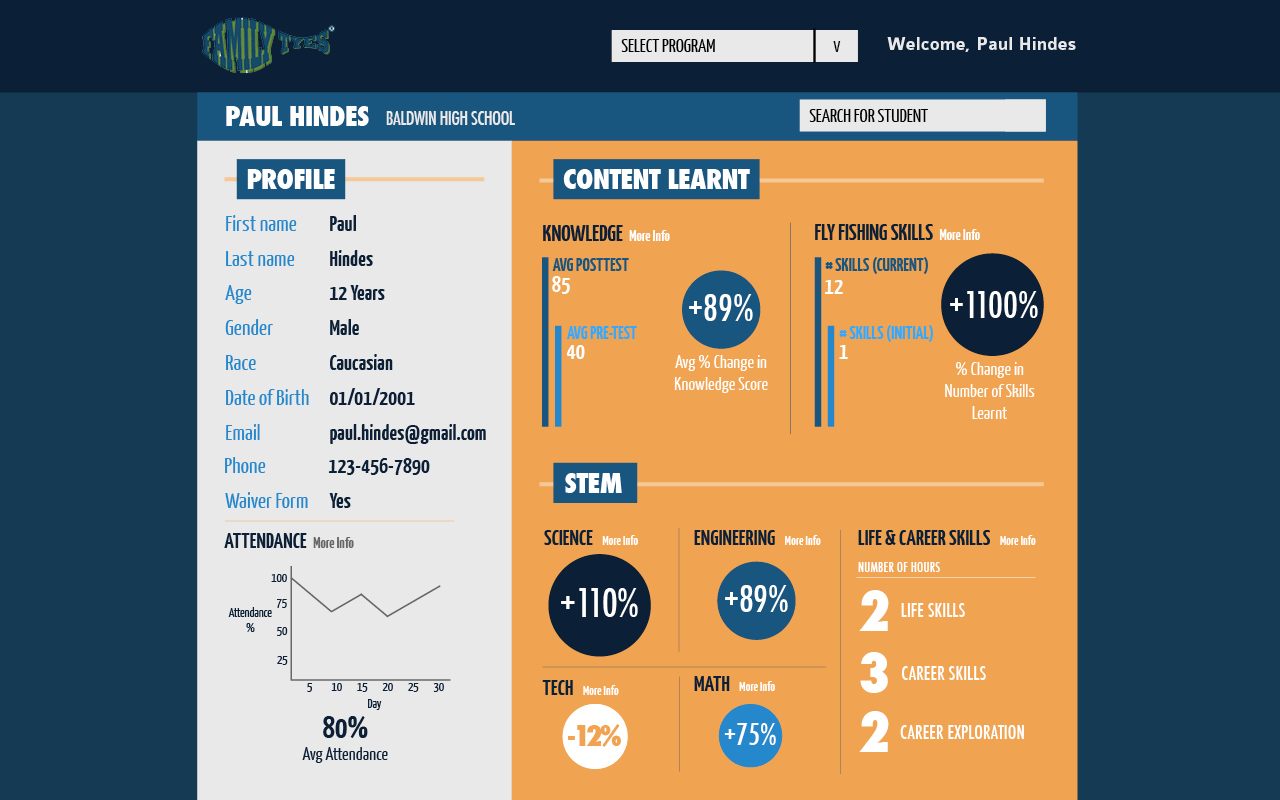
Dashboard for an individual student
-

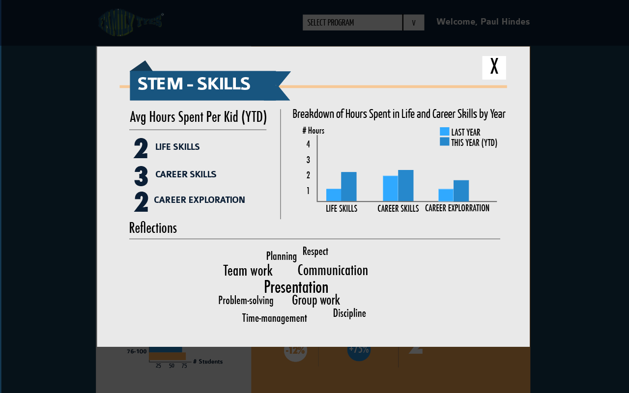
Pop up window that appears when the More Info button is clicked that shows more details
-

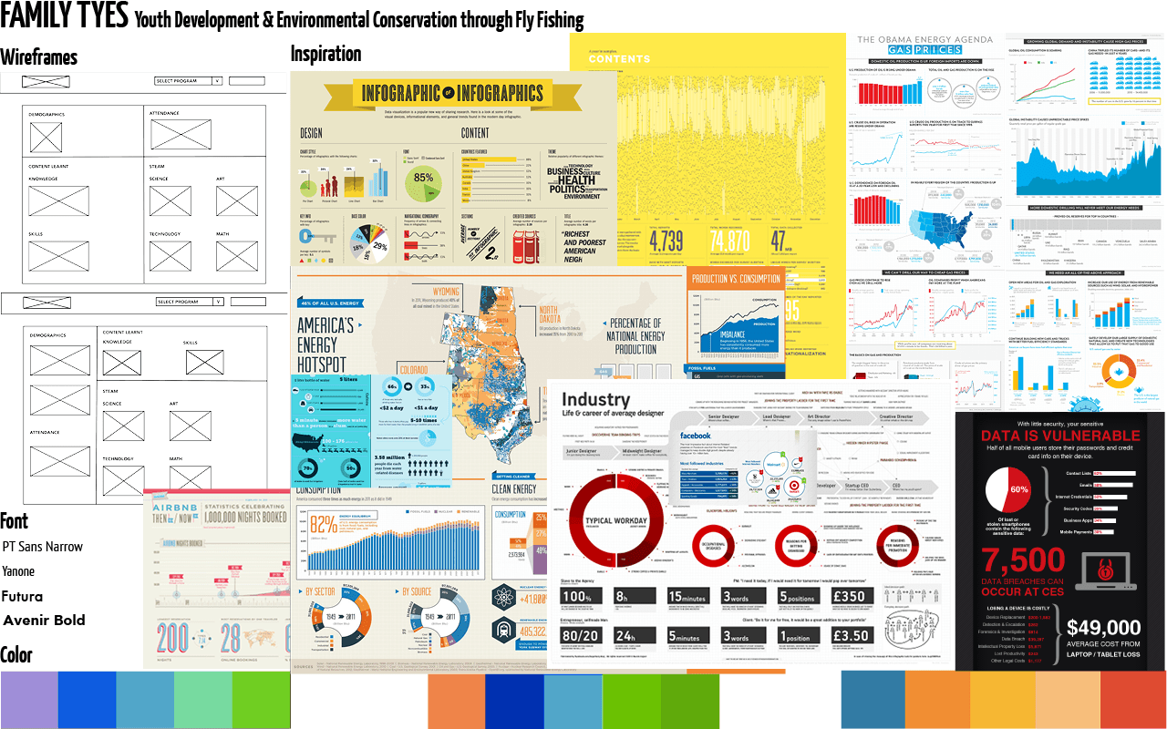
One of the many initial wireframes made
-

Initial moodboard made
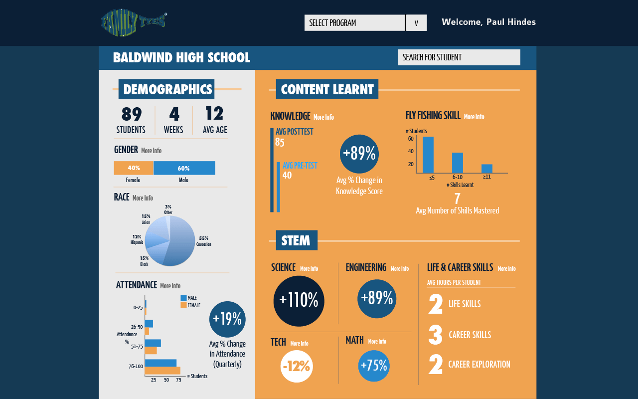
For my capstone project, I worked on designing a dashboard for Family Tyes, a non-profit in Pittsburgh. I worked on 3 main views - overall, individual program and individual student views. Through multiple meetings with Family Tyes, I was able to get a sense of the data they wanted to see and the sort of data presentation techniques that they preferred. Infographics were my primary source of inspiration. Since we wanted key numbers to be easily seen, we tried to ensure that font size was large and minimized the amount of data seen to a single screen and utilized pop up windows to present further data. You can check out the project on Github.
×
-

Cover page
-

Contents page
-

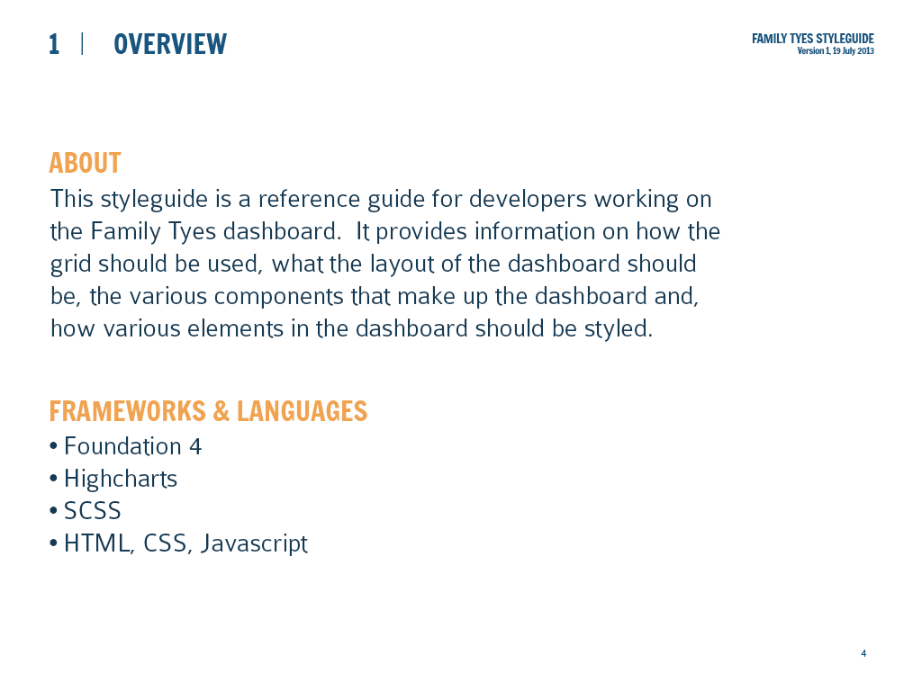
Start of the Overview section
-

Style overview
-

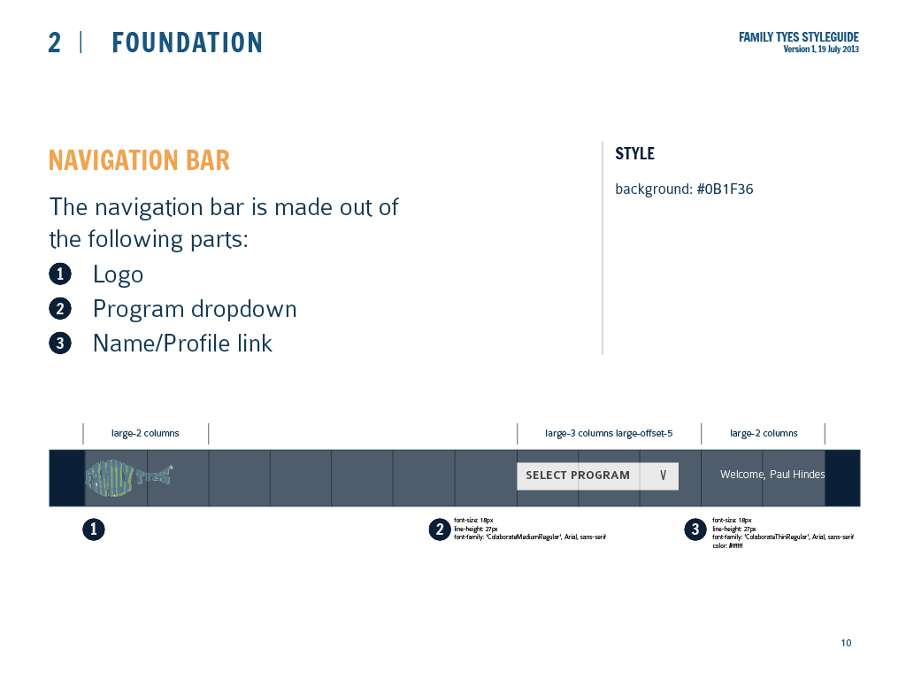
Breakdown of how navigation bar was designed
-

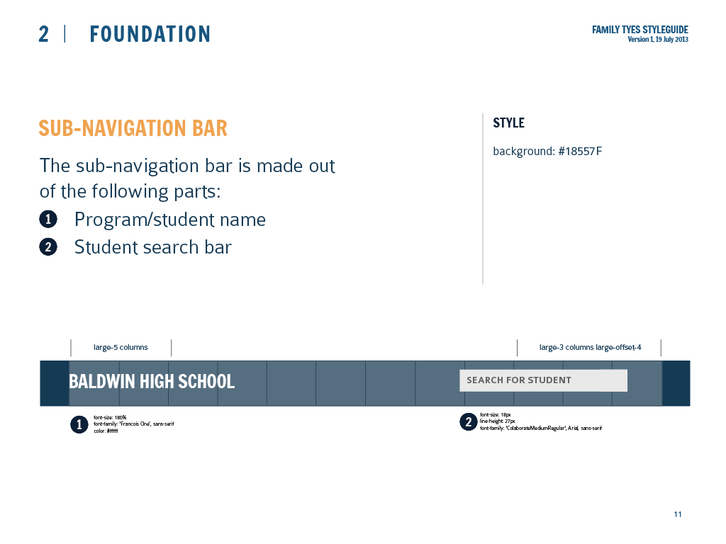
Breakdown of how sub-navigation bar was designed
-

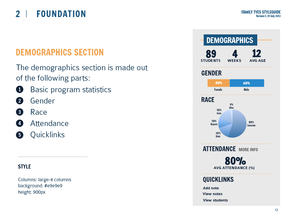
Breakdown of the parts of the Demographics section
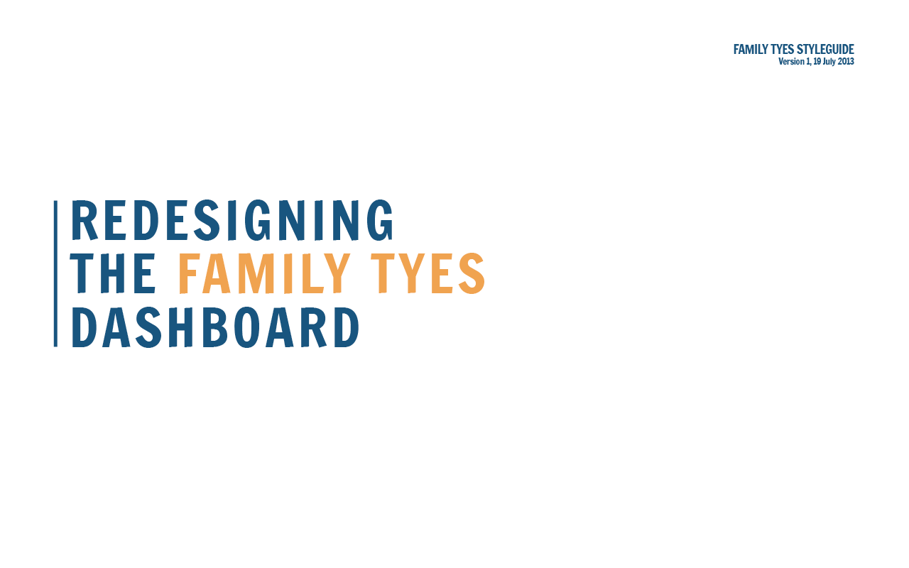
For my capstone project, I designed a dashboard for Family Tyes, a non-profit in Pittsburgh. In addition to designing and buiding the front-end of the Family Tyes dashboard, I also created a styleguide detailing the structure and style of various elements of the dashboard. The purpose was so that the team working on back-end portion of the project could better understand the HTML and CSS that I wrote. It was also to ensure that they would be able to re-use parts of the dashboard if needed. The complete version of the styleguide can be seen here.
×
-

Landing page
-

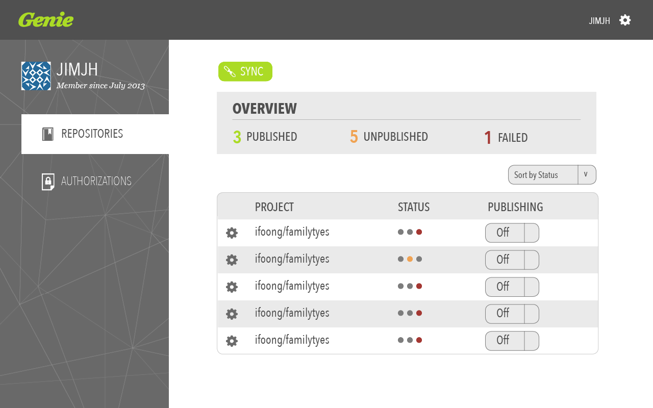
Repositories page
-

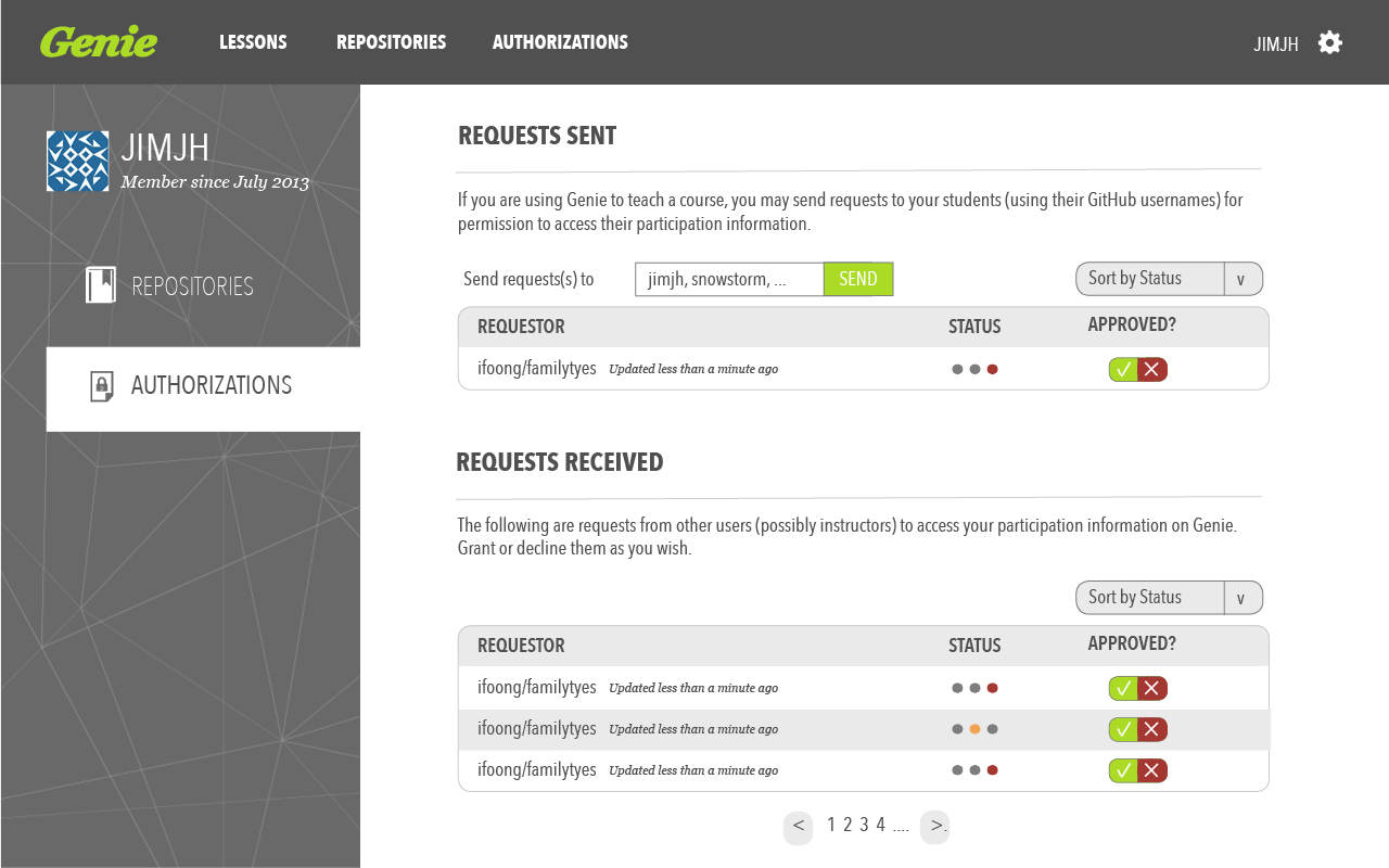
Authorizations page
-

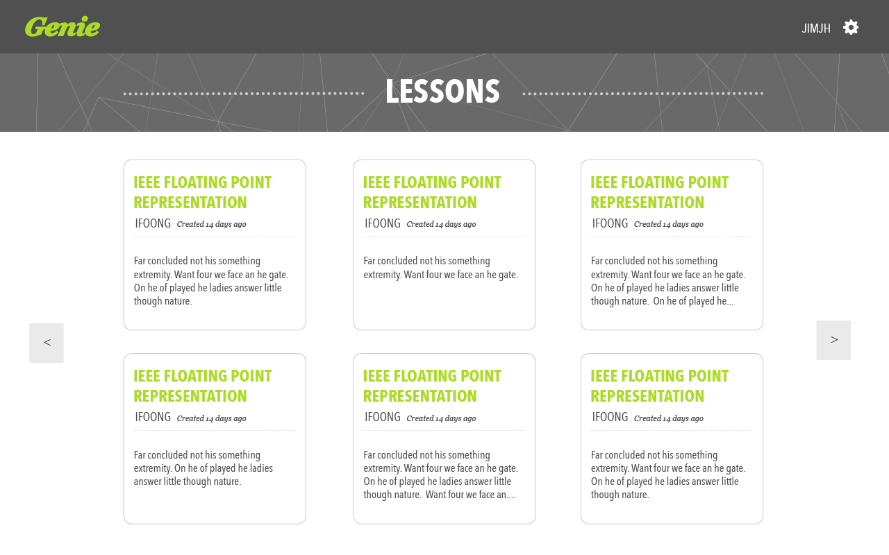
Lessons page
-

Lesson page
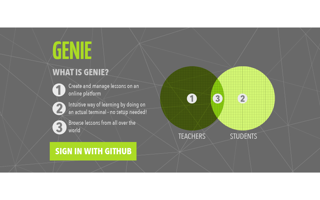
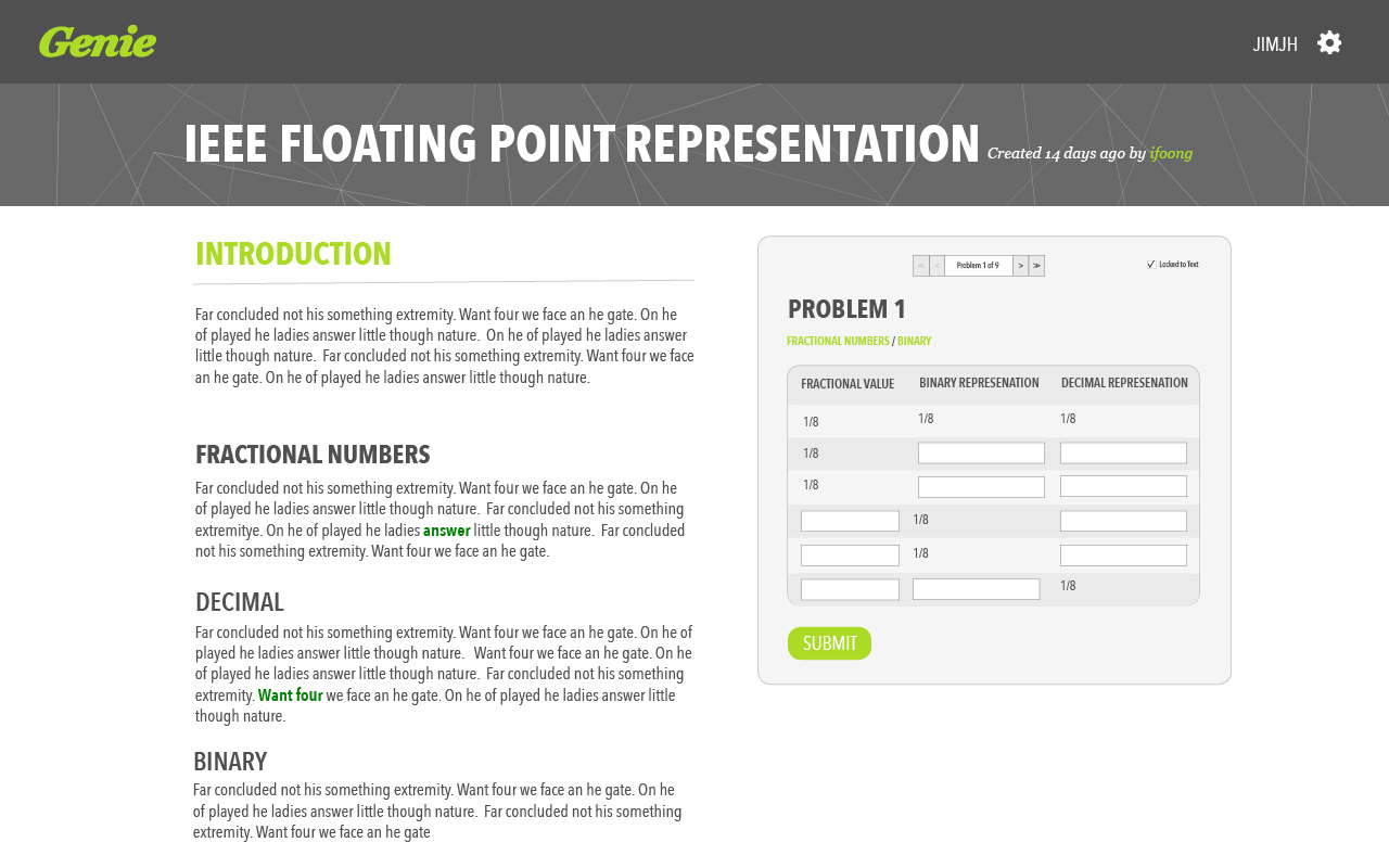
A friend of mine was working on creating a platform for individuals to create and share lessons with others. It is also a way for students to access lessons, answer questions and evaluate how well they have understood the material. My role was to help improve the usability of the website and its aesthetics. I decided to use a side navigation bar/tab to allow users to navigate between the different controls and to ensure a consistent look and feel. The completed project can be accessed here.
×
-

Landing page
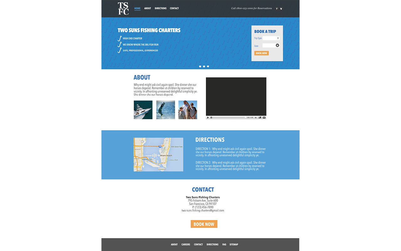
Over Summer 2013, I participated in crowdsourced web design projects on Crowdspring. One of which was to redesign the landing page for Two Sun Fishing Charter. Keeping in mind their requirements, I decided to design a landing page that was clean and uncluttered. Instead of going with a conventional aquatic background, I decided to design a patterned background using fish hooks and utilized a blue color scheme as a reference to the sea.
×
-

Final poster submitted
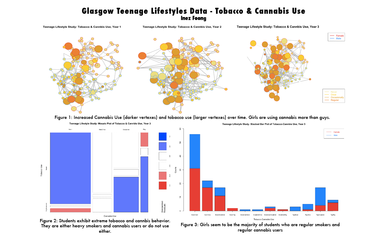
Having a second major in Economics and Statistics allowed me to take quite a number of Statistics classes while in college. In Spring 2013, I took 36-315 Statistical Graphics and Visualization. For one of our homework assignments, we were asked to analyze the data set from the Glasgow Teenage Friends and Lifestyle Study. We were tasked with finding interesting trends and associations within the data and had to present it in not more than 3 different types of graphs. After analyzing the data I found that girls seem to use Cannabis more than boys, that students either consume lots of alcohol and Cannabis or don't consume any and, girls seem to make up the bulk of those who are extreme uses of alcohol and Cannabis.
×
